Plug was born out of necessity to bring us closer to the people, places, and music that we love in our day to day lives. Great for use on road trips, during workouts, and late nights in the library with your friends, Plug makes it possible to enjoy music together.
Spotify, Apple, and others may have social music listening services, but Plug creates an ecosystem around music sharing. With Plug, it's possible to connect with strangers, the people around us, and even our favorite musicians. The high fidelity prototype for Plug was made in Figma, and user research supported design decision making throughout the process.
I developed the full branding and fundraising strategy for a new municipal park in Long Island. This included a custom website, a mailed fundraising brochure, and a mail-in donation form designed to engage the community. Together, these tools helped raise over $500,000 to bring the park project to life. The result is a unified campaign that connects residents to a shared vision for their local green space.
I ran this project for SpringWorks Therapeutics last summer. The ask was simple: "tenacity is at the heart of all that we do. Patients, families, and SpringWorkers are tenacious and that is a core facet of our identity. How can we engage our SpringWorkers and build morale around this concept?" As program manager, creative director, and strategist, I owned every aspect of this project.
An exploration into the modular, utility-driven workout gear I want to see in the world. Here, I am merging user needs with business strategy. I developed a series of tech packs to visualize product features designed to drive both performance and long-term customer value.
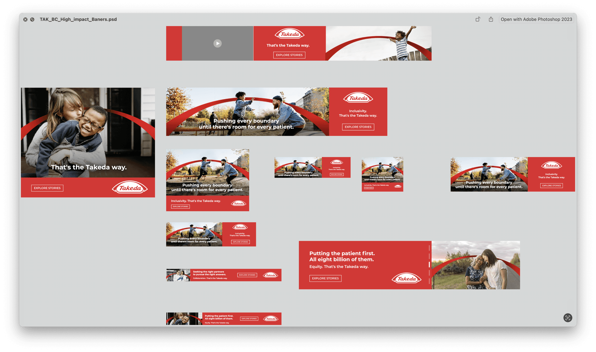
PJA is a boutique, full-service, digital-centric agency that lives to work for complex, innovation-driven categories — biotech + life sciences, technology, fintech, cybersecurity, and others — where change is constant, stakes are high, and how companies portray their brand is important.
Flux Marine is redefining the entire experience of boating. In developing a fully proprietary electric outboard motor, Flux Marine knew they wanted something equally striking and innovative for a user interface.
In designing the entire throttle UI/UX from scratch, I needed to start with the end user and realize exactly how boaters interact with their craft. I conducted user interviews to gain insight into the most effective mode of interaction. FluxUI puts all of the controls of a traditional helm into a tiered, modular system, and the guesswork of where to find information is eliminated.
Clothing & Creative
Fippo came about during one doodling session in my 7th grade math class. I remember that much vividly. As for where the brand and Fippo is today? Unsure. One thing is certain— Fippo has been my longest and most pure form of creative output. As long as I have known art, Fippo has ended up on things I make. I am very interested in fashion and the latest in the space, and Fippo has often stood as the output of such.
Pictured is a selection of clothing from my fippo.store website and @fippo.store Instagram page, where I sell some of my pieces. Many of my pieces were photographed in the Time Machine, a photography studio I built in California.
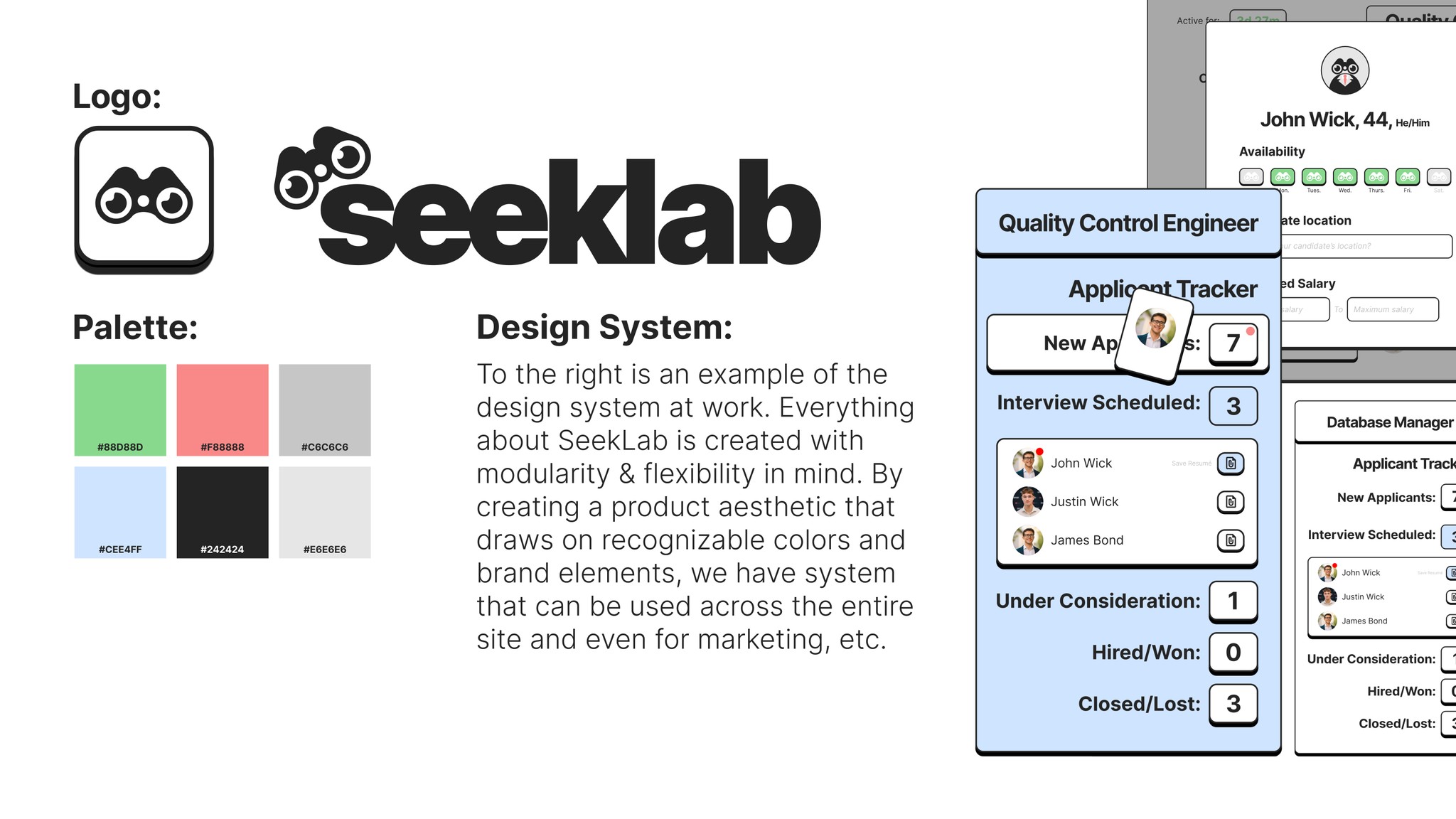
SeekLab is trying to redefine modern day recruiting. Some companies are pouring resources into AI to create talent sourcing platforms, but SeekLab believes that the experience falls short without the human factor. SeekLab is seeking to turn recruiting into a three-sided marketplace, where recruiters, applicants, and companies can all go to interact with "bounties" and satisfy job searches
I created the visual & brand identity for SeekLab in my role, as well as a design system which they are using to create the first iteration of the platform. SeekLab is in beta.
Enterprise B2B Software
I worked with Exari in a 3-month sprint as a marketing intern. Working directly with the CMO, I produced collateral for social, internal graphics, presentations, ads, and more. I also produced and directed software tutorials that were used with Exari’s largest customers. This meant developing a design language that informed my work within the brand guidelines. Big, bold set typefaces would be the centerpiece. Exari was a small player in the much larger contract lifecycle management market, and they needed to set themselves apart with bold moves and a design aesthetic to match.
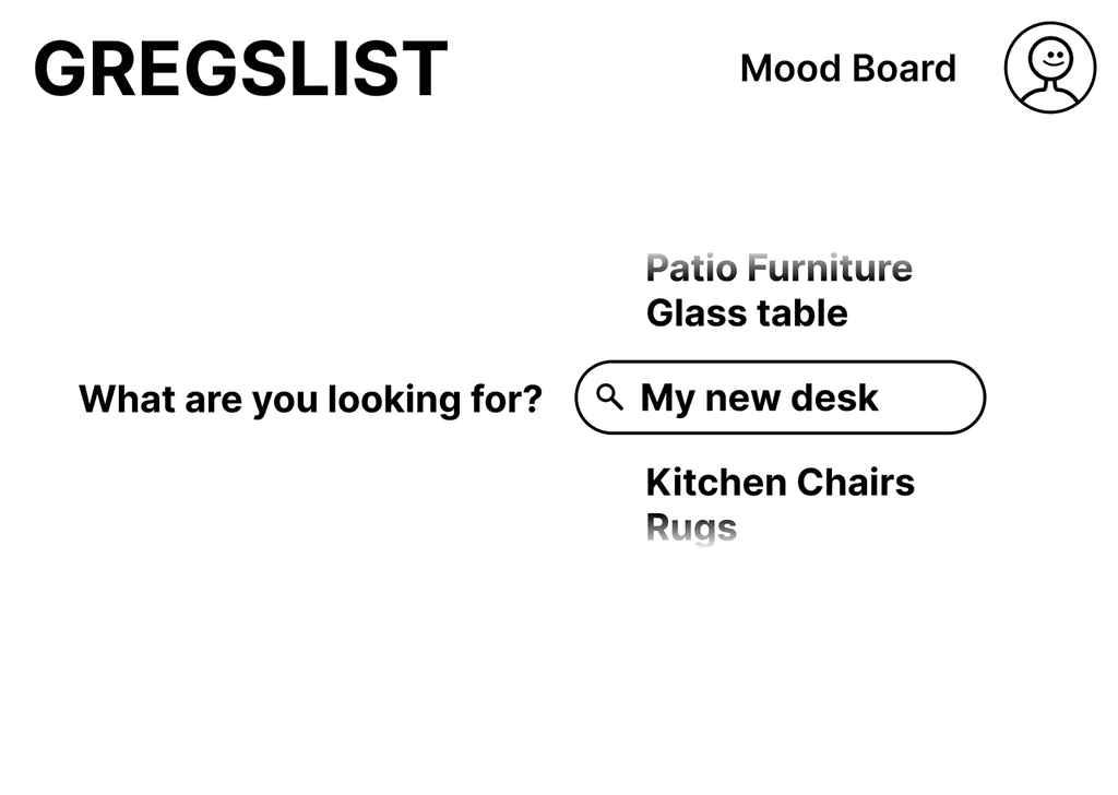
Gregslist is an exercise in redesigning Craigslist for the modern day consumer. I began my project by defining the users I was designing for, creating a user flow, pinpointing the pain points where the user exits without making a sale. I took this, as well as the feedback from several user interviews, and created a user persona. Using UX design principles and UCD in order to guide my design, I implemented 3 major new features that will change the way people approach purchasing. The final product is a fully formed medium fidelity prototype with a user flow indicating that the new site is much more effective in converting prospective buyers into paying customers.


